| company | role | year |
| ux design intern | 2016 |
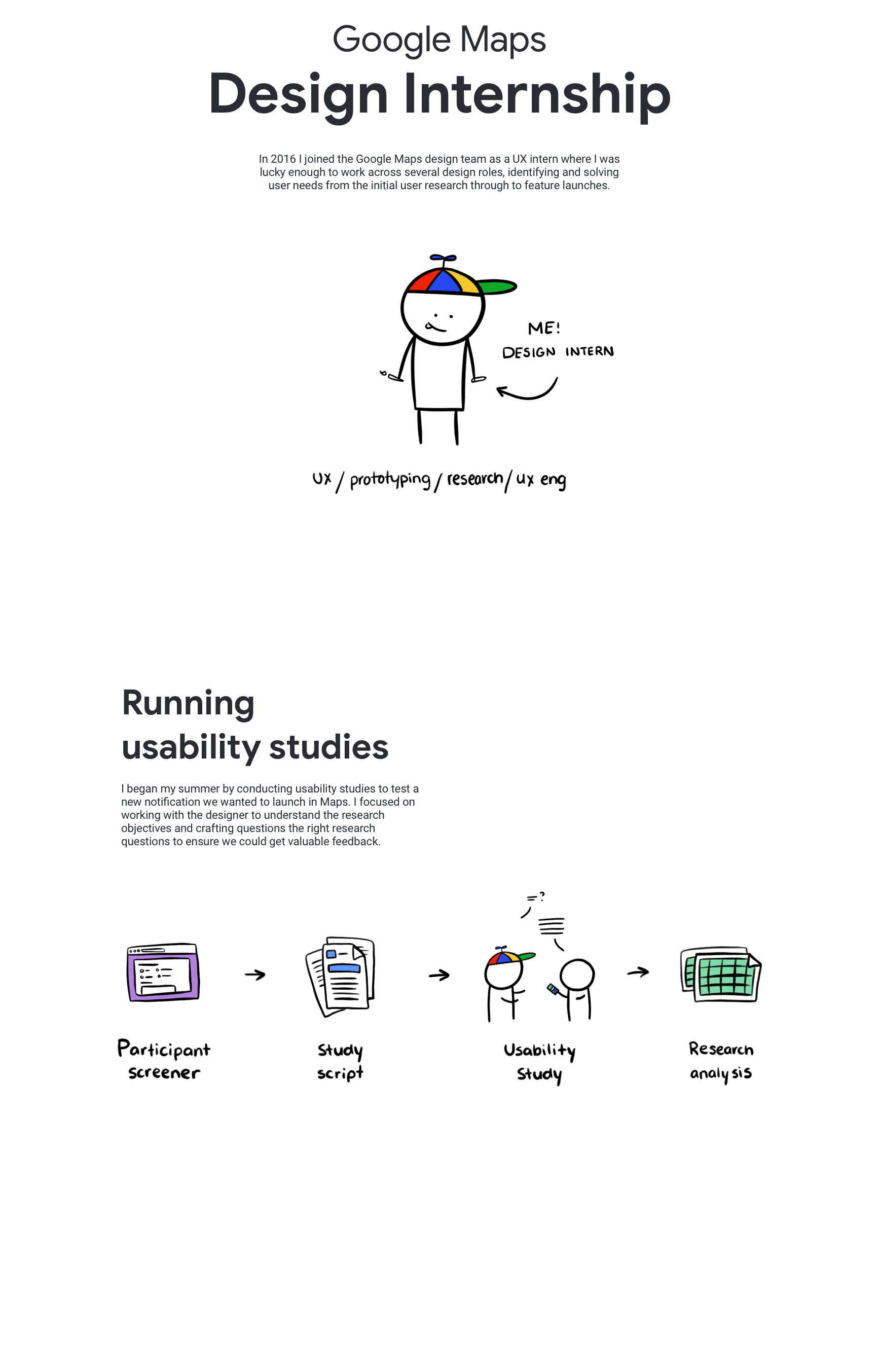
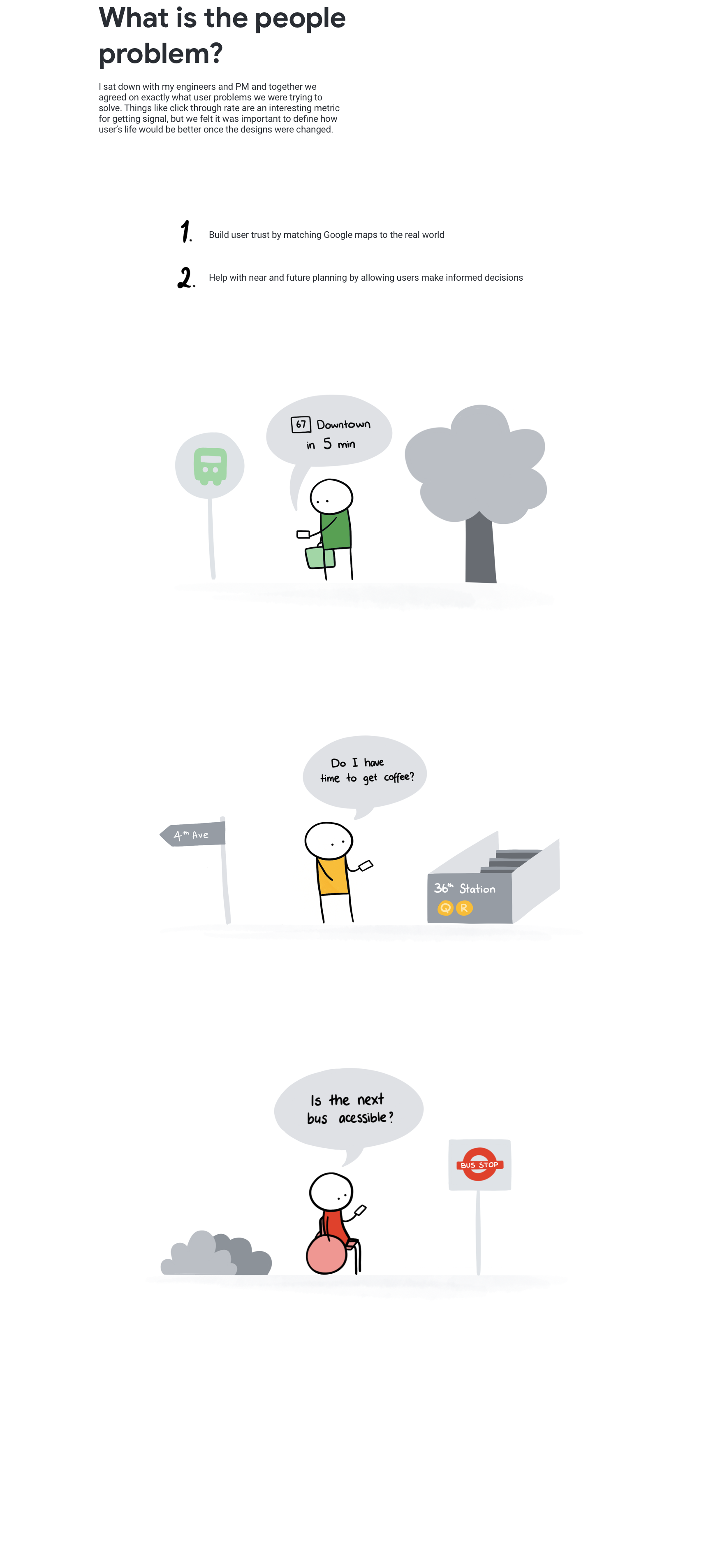
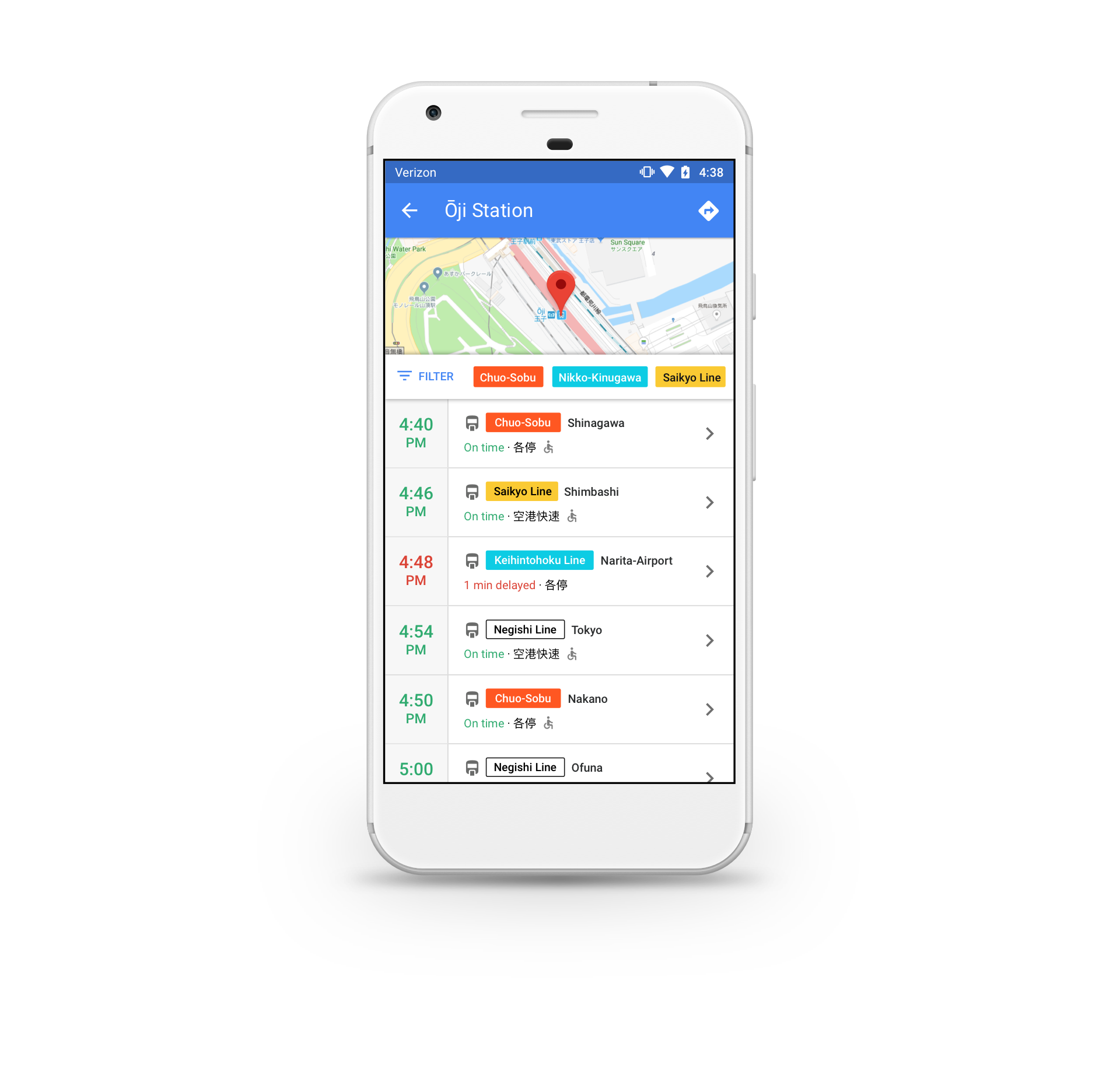
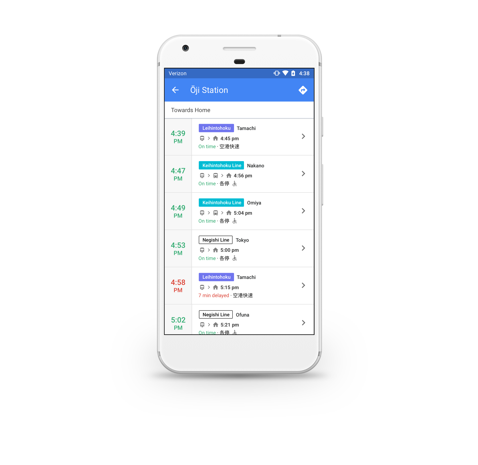
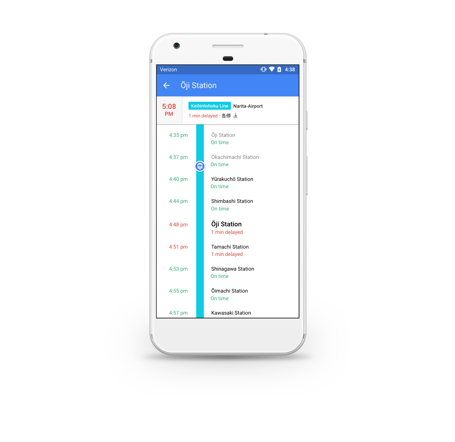
In 2016 I interned at Google where I worked on a redesign of the public transit experience for Android Google Maps. The primary focus of the redesign was to help commuters understand which transit departures worked best for them. Some of the ways we supported this in the redesigned flows included allowing users to filter and compare departures and showing vehicle metadata like accessibility and delays.
My role in this project was leading the early stage concepting and wireframing through to creating visual polish and redlines. Today the new designs are used on phones all over the world in Google Maps. Check out my final designs below or see them on twitter @GoogleMaps.
Entry Points
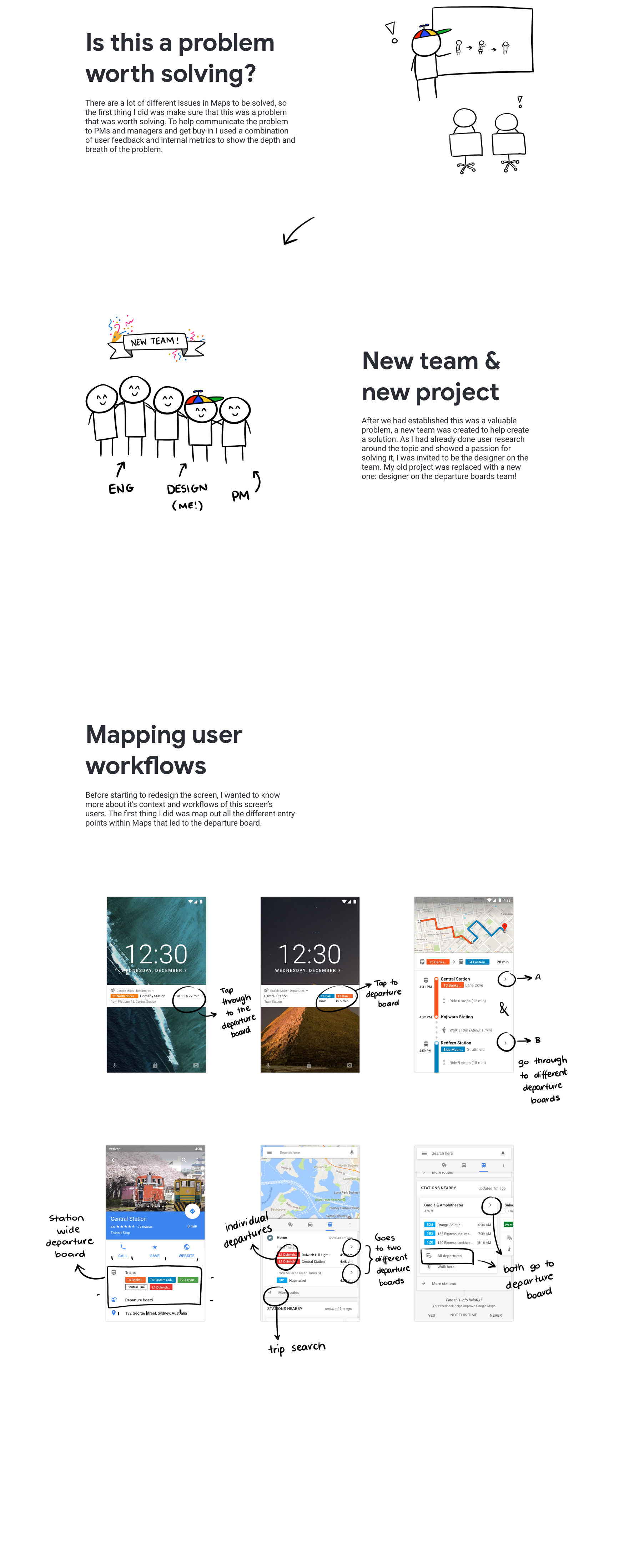
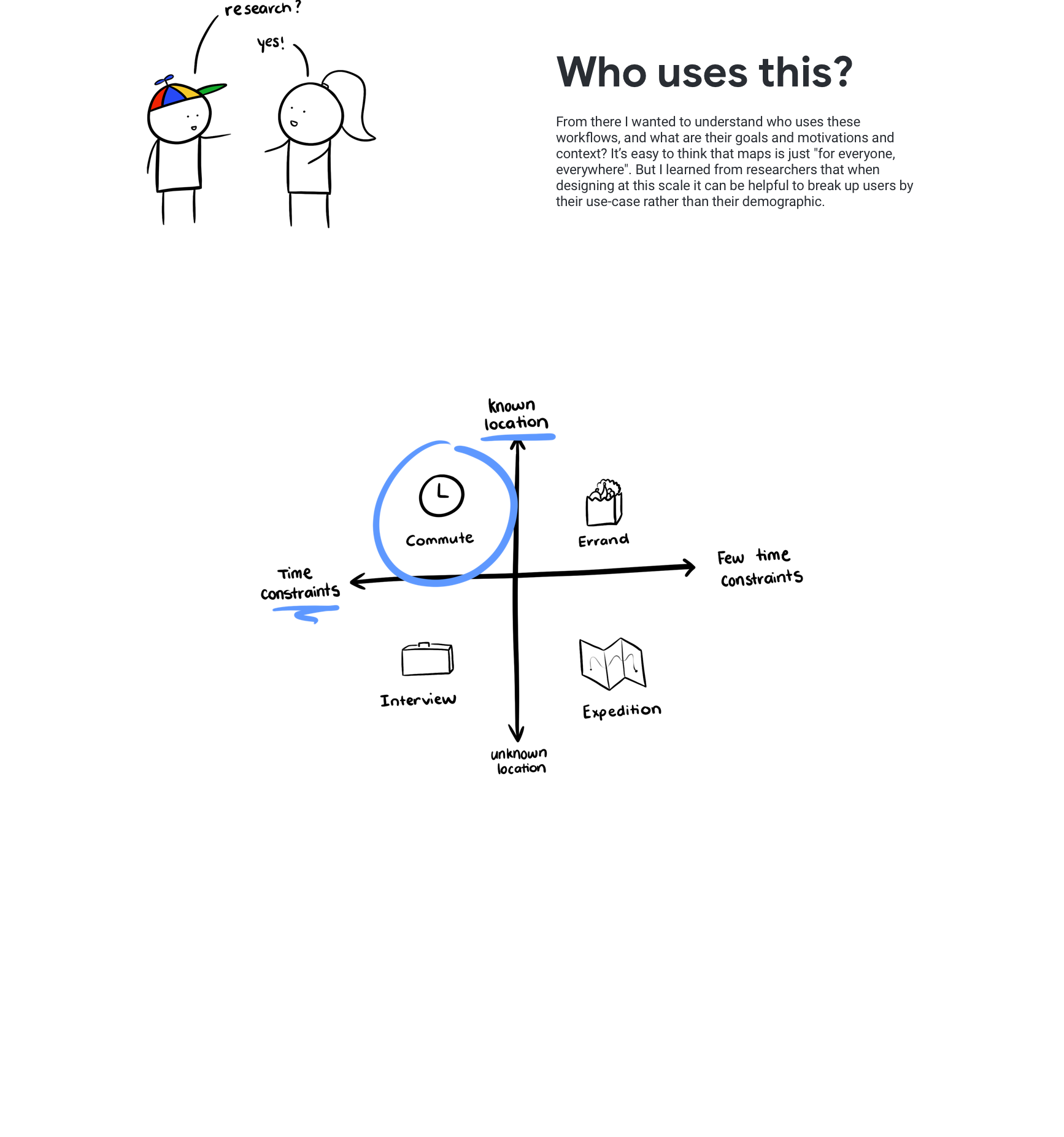
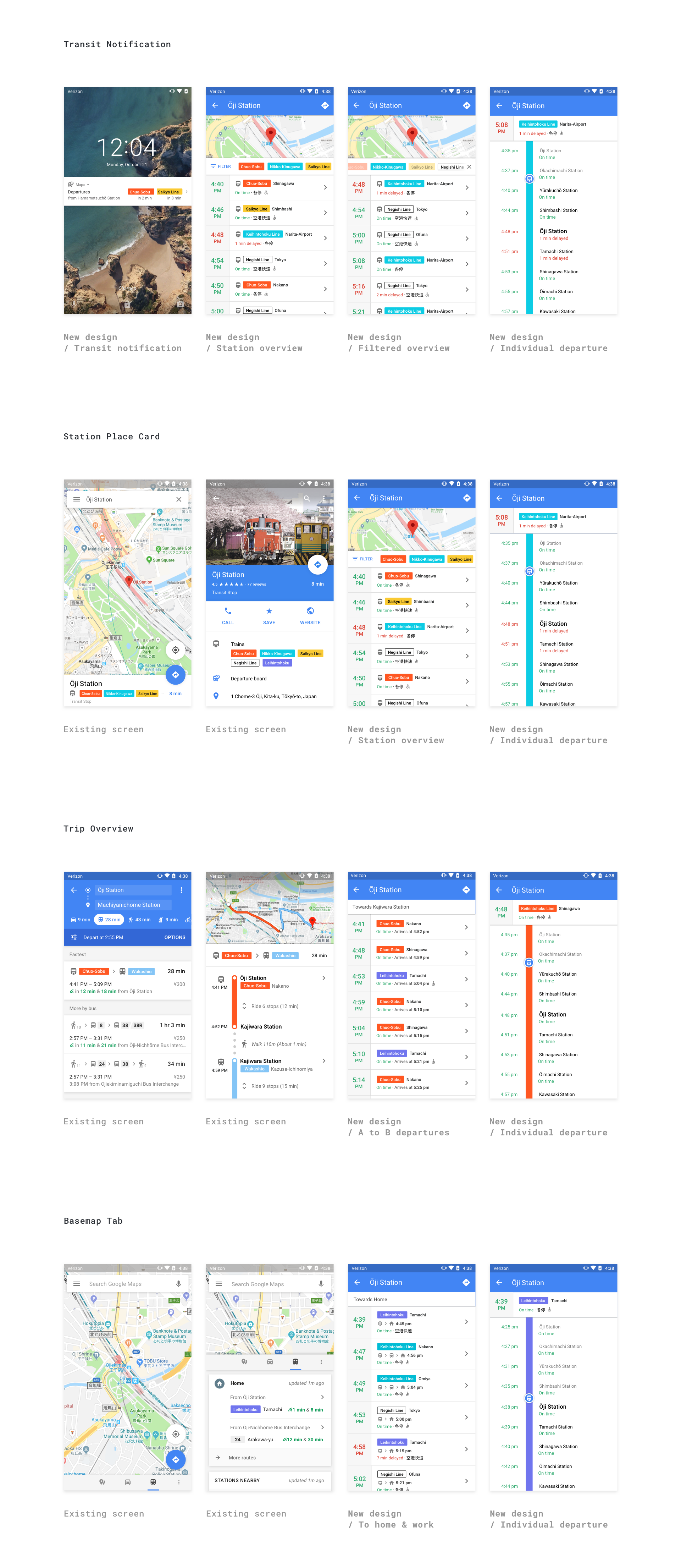
One of the complexities of this project was the number of entry points this workflow had across maps. After white-boarding out all of the different flows, I collaborated with UX researchers to understand the user goals and motivations behind each of the separate use cases. By doing this, we were able to create a far more tailored experience for each flow to meet the needs each user, whether they are a commuter or a tourist. This worked a lot better than the one-size-fits-all approach that we had previously used.
Designing At Scale
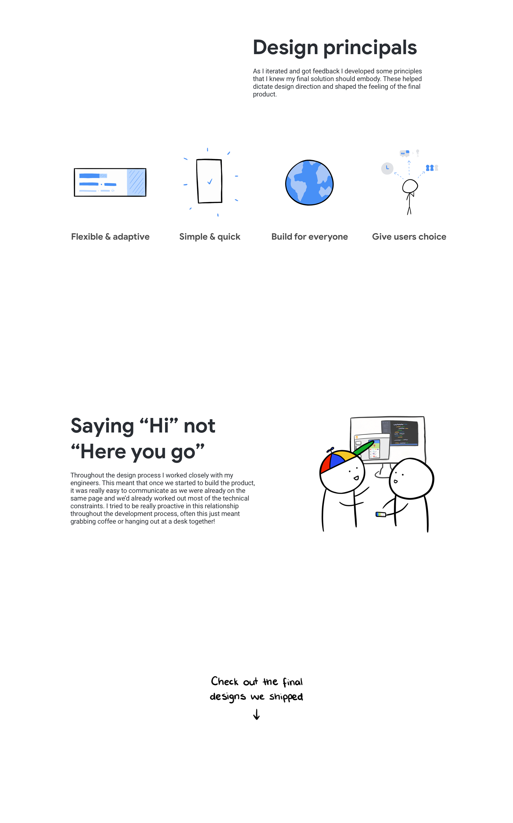
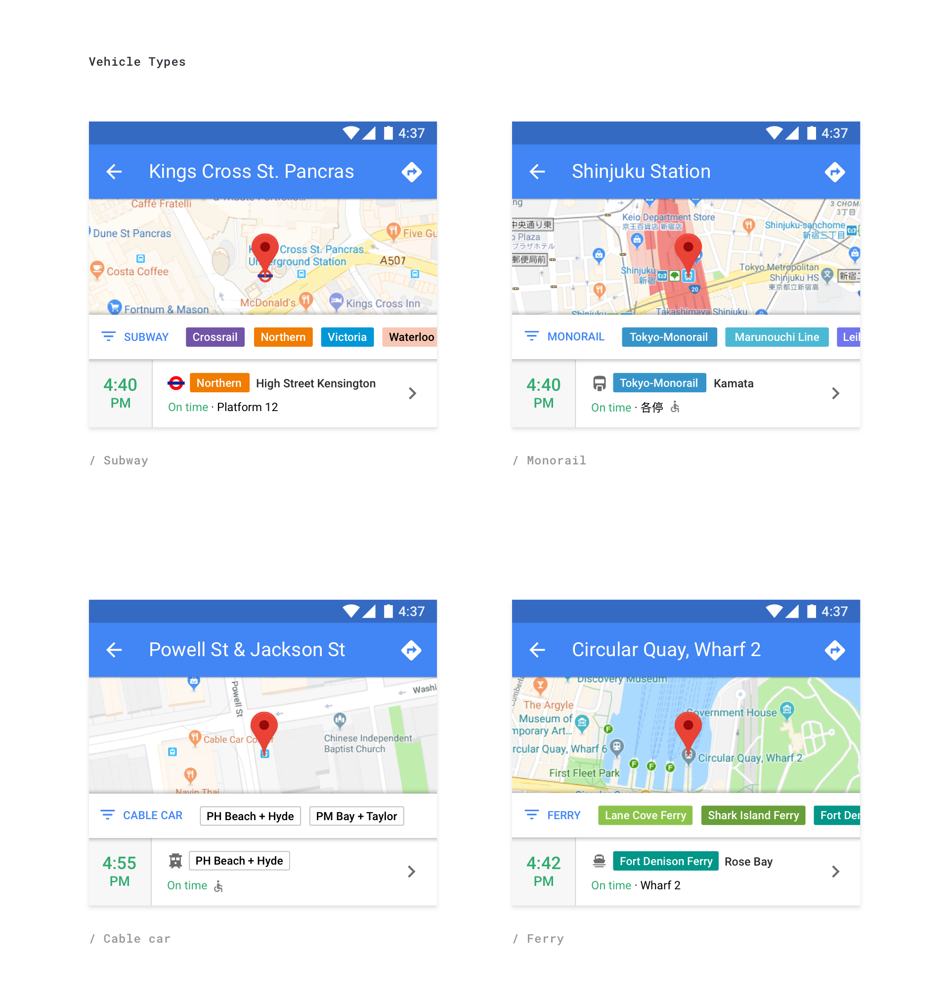
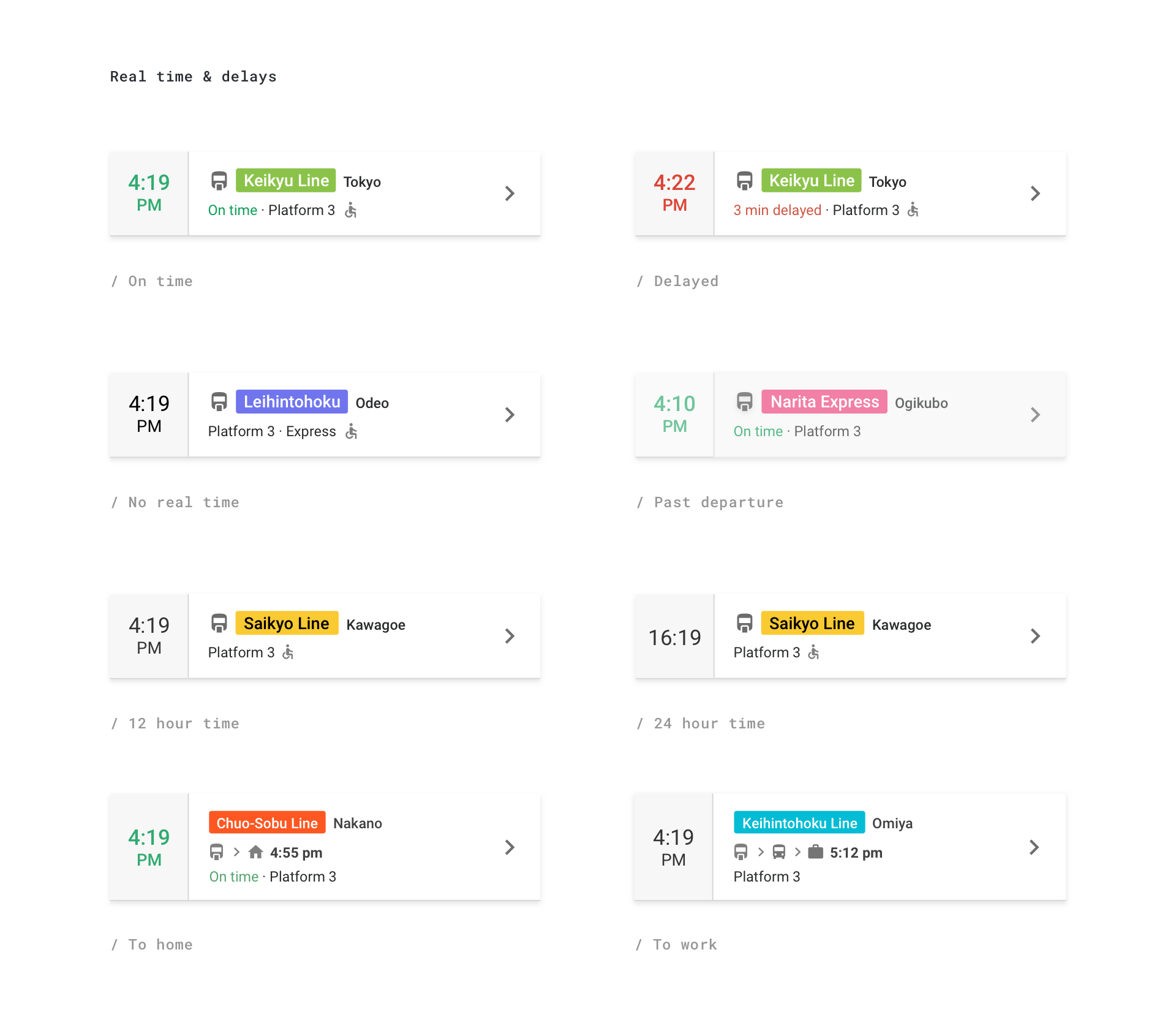
It was important that the designs were still clean and legible when used with the vast array of different data pipelines in Google Maps. We did this by creating a strong information hierarchy that was still flexible and then tested with a variety of different live data sets. Some of the different considerations were language, vehicle type, time format and accessibility.

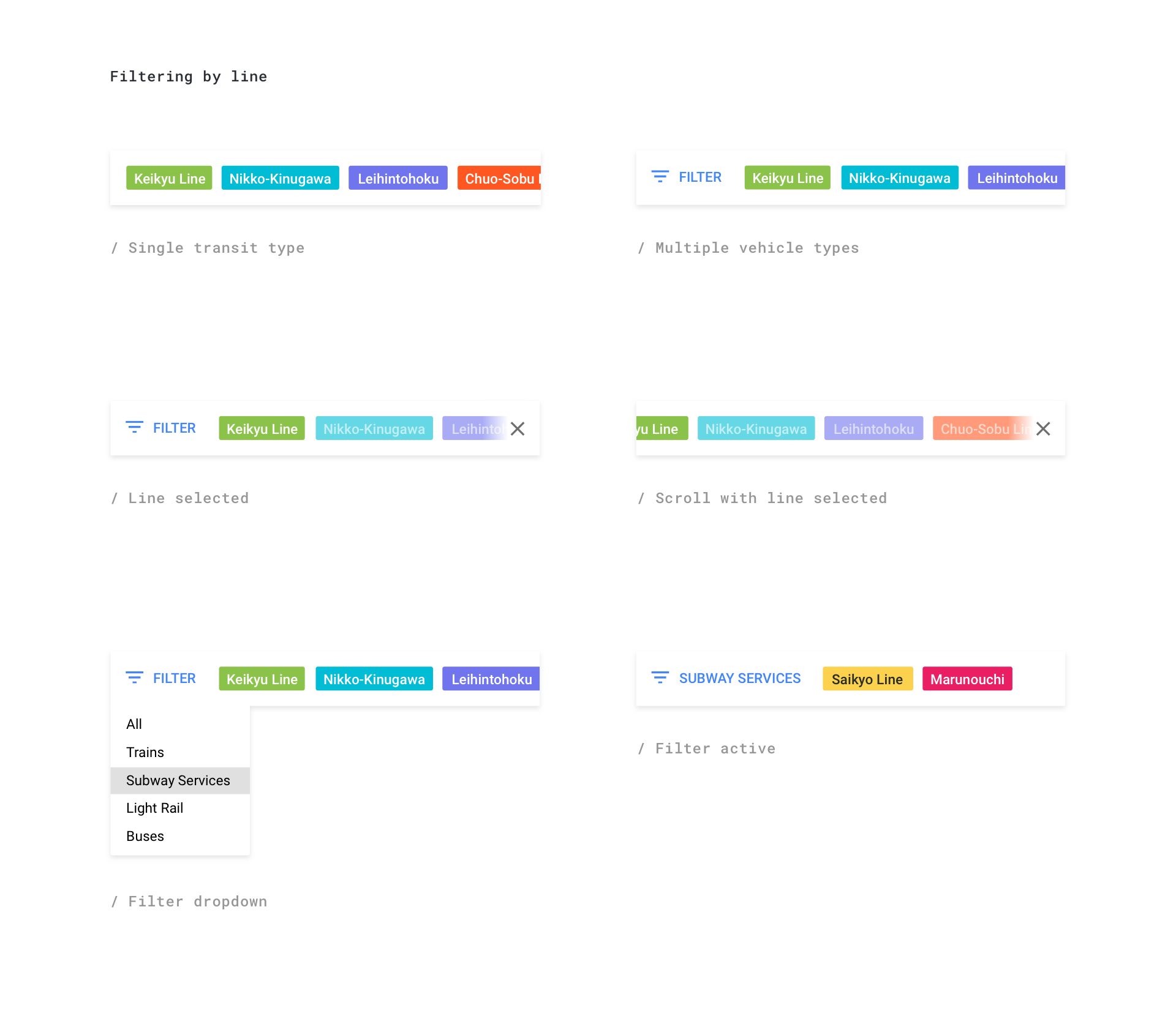
Filtering
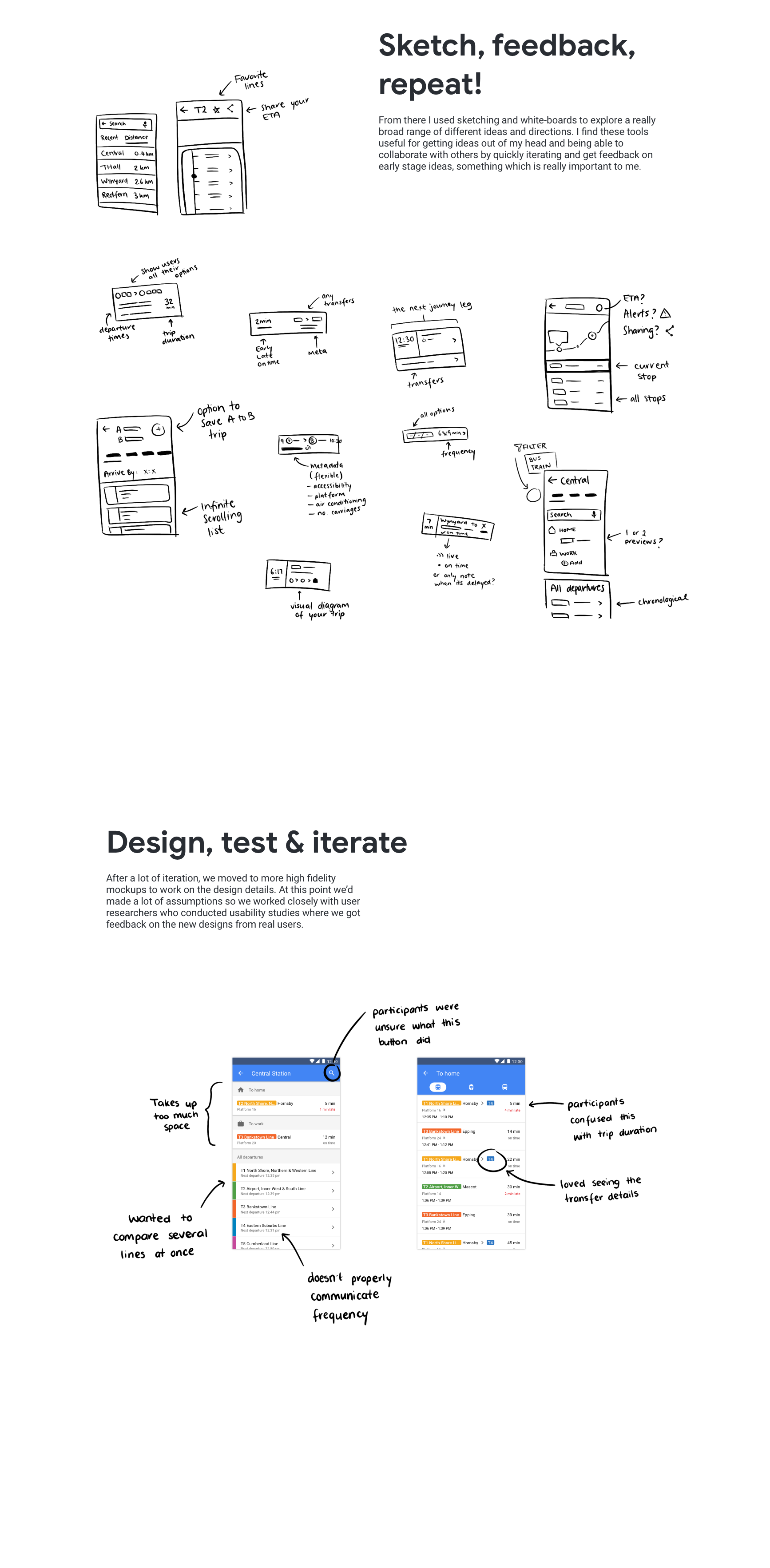
As we worked with user researchers it became clear that most users only cared about a sub-set of the departures leaving any given station. During the redesign usability testing showed that rather than narrowing down to an individual line, users wanted to be able to compare departures from multiple lines.
This led to the current design where the tabbed bar lets users narrow the departures down to the lines they care about and the filter dropdown which accommodates stations with multiple vehicle types.
